![Fundmore-Logo.png]](https://help.fundmore.ai/hs-fs/hubfs/Fundmore-Logo.png?height=50&name=Fundmore-Logo.png)
Table of Contents
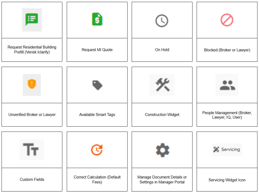
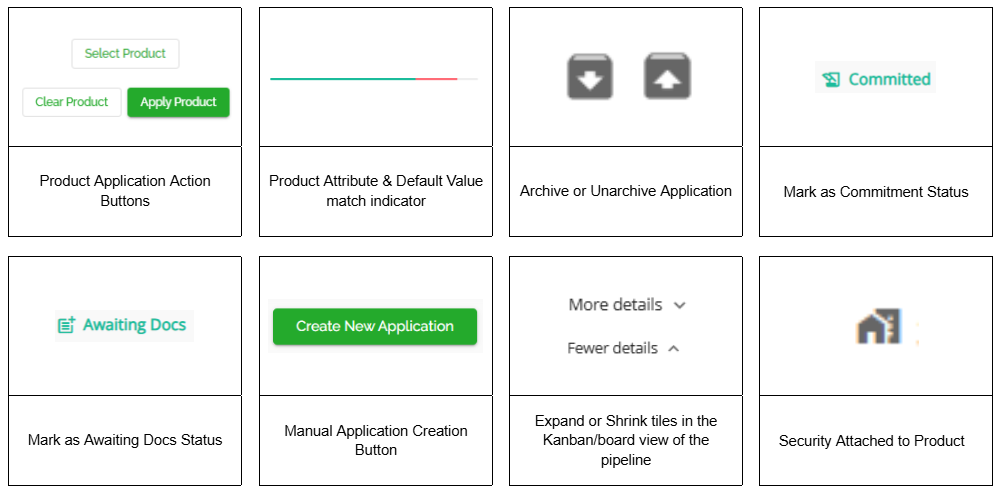
Common UI Elements and Terminology List
Introduction
FundMore.ai strives to provide lenders with the best user experience, latest technology, scalability and security. This guide outlines the key user interface conventions used across our platform to ensure a consistent and intuitive experience. We aim to create a seamless interaction style that enhances usability and helps users navigate features with ease. Whether you're managing data, customizing views, or interacting with various components, the conventions discussed in this guide are designed to provide clarity and efficiency in every step.
Note: Some of the icons may or may not apply depending on your company’s particular configurations.
Application Design
Tables
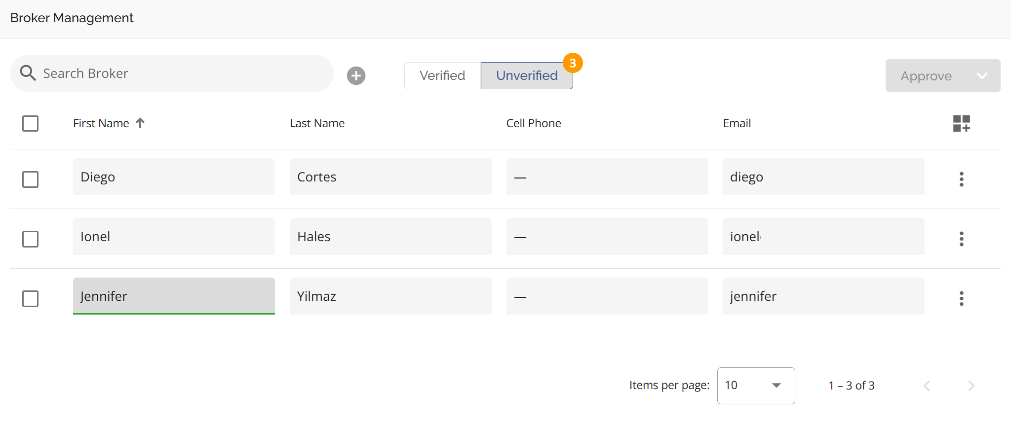
Our tables follow modern user interface best practices, ensuring a consistent and intuitive experience across the application. To enhance the user experience, we support inline editing, allowing users to modify data directly within table fields. When a user selects a field for editing, it becomes highlighted, serving as a visual indicator so users know what fields they are about to interact with. Data edited in line saves automatically.
Customize Table

To enhance the user experience, tables can be customized to fit your specific needs. Look for the Customize Table icon (seen above) to:
- Select which columns to display
- Rearrange columns by dragging them into your preferred order
- Hide columns that are not relevant to your workflow
This feature is available wherever the Customize Table icon appears. These sections include Broker Management, Conditions Management, Lawyer Management, Fees Management, Investors, & Task Template in the Manager Portal and Existing Mortgages (Property Details), Fees (Fees tab in Loan Details), Appraisals (Property Details), Net Worth Widget (Property Tab), Conditions (Conditions and Documents Widget), and the Credit Widget in the UI. The customization is user specific and will remain for that user until such time as they edit the table.
To Customize a Table, follow these steps:
1. Click the Customize Table icon.
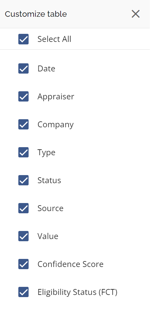
3. Select the checkboxes for the columns you want to display.
4. To rearrange columns, hover to the left of the checkbox. When the reorder icon (see below) appears, click and drag them into your preferred order.

5. Close the sidebar, and the table will update automatically.
Form Fields
Our form fields are designed to clearly indicate editable content and visually differentiate various states for a more intuitive experience. The input areas are styled with distinct borders and background colors to help users understand their current state.
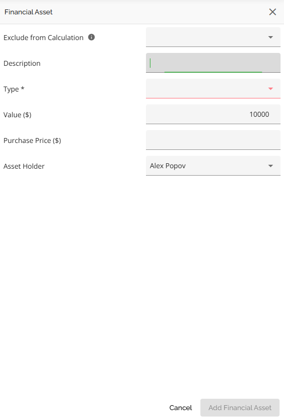
Form fields can appear in the following states:
- Default (Editable): Light gray background
- Disabled: No background color, but text remains visible in the default color
- Hover: Medium gray background
- Focus/Active: Dark gray background and green underline (appears when a user is actively editing the field)
- Required/Error: Red underline (appears when a required field is left blank or when the input format is incorrect)
Drop-downs
Drop-down menus allow users to select one or more options from a predefined list. Fields with a drop-down menu are indicated by a downward-pointing arrow, signaling that additional options are available.
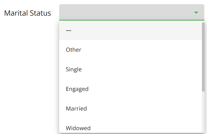
Here are some key features of drop-down menus:
- Visual Cues: A checkmark is used to indicate selected items within the drop-down for the single-selection fields.
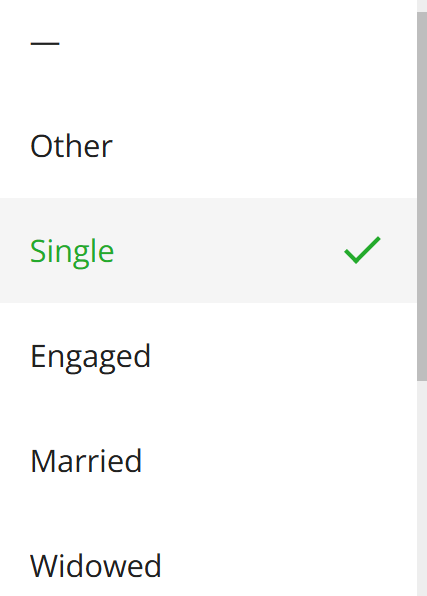
- Single-Selection Drop-downs: Clicking an option selects it, and the menu closes automatically. The selected item is displayed in the field.
- Multi-Selection Drop-downs: Users can select multiple options, each marked with a checkmark. Selected items remain highlighted, and the menu stays open until the user clicks away.
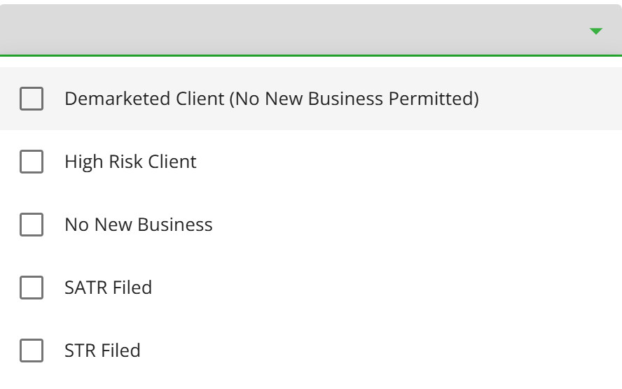
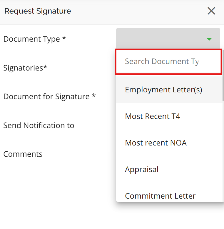
- Searchable Drop-downs: For long lists, users can type in a search bar within the drop-down to quickly find options.
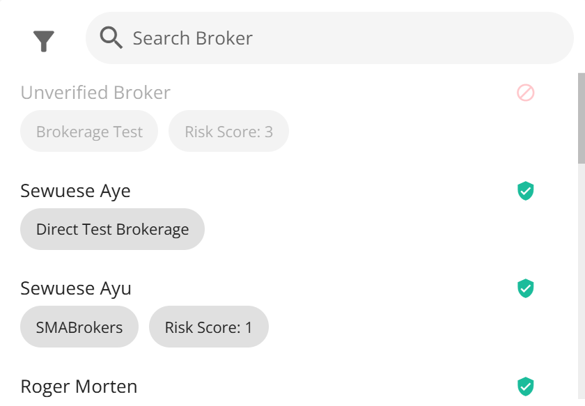
- Disabled Options: Some options may appear grayed out when they are unavailable for selection.
Common UI Elements and Terminology List
This section defines key user interface elements and functionalities used throughout the platform. Understanding these terms will help users interact with the system more efficiently.
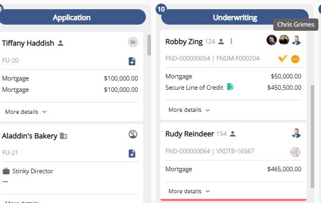
- Avatar Profile Icon for Deals: In the Pipeline View, users can quickly see who is assigned to a deal through an avatar profile icon displayed at the top right corner of the deal card. Hovering over the icon expands it, showing the name of the assigned user or other team members. If no one is assigned, an "unassigned" icon is displayed.
- A user’s Avatar Profile Icon is their profile picture (or initials if no picture is set) set up in their Settings tab.
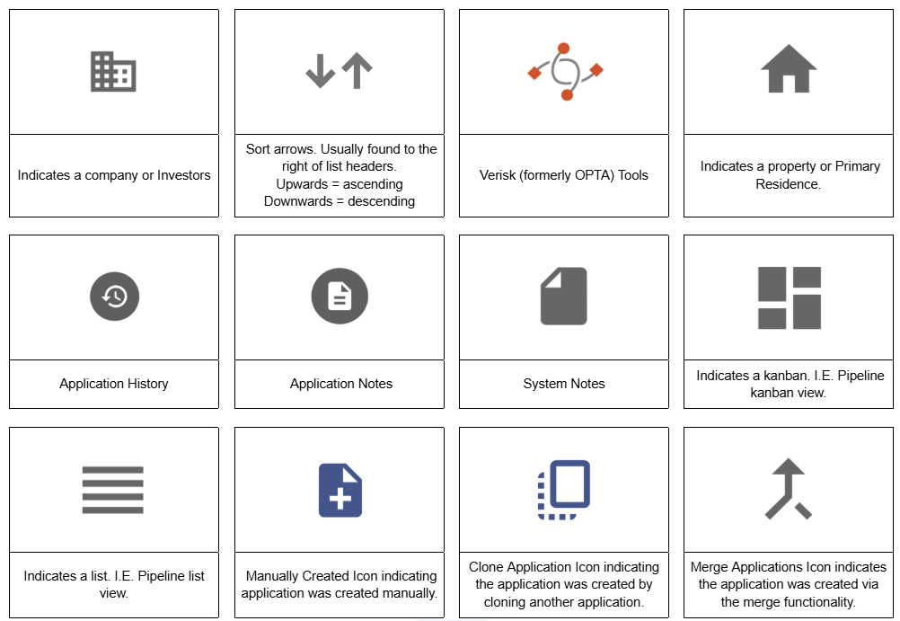
Board/Kanban View:
List View:

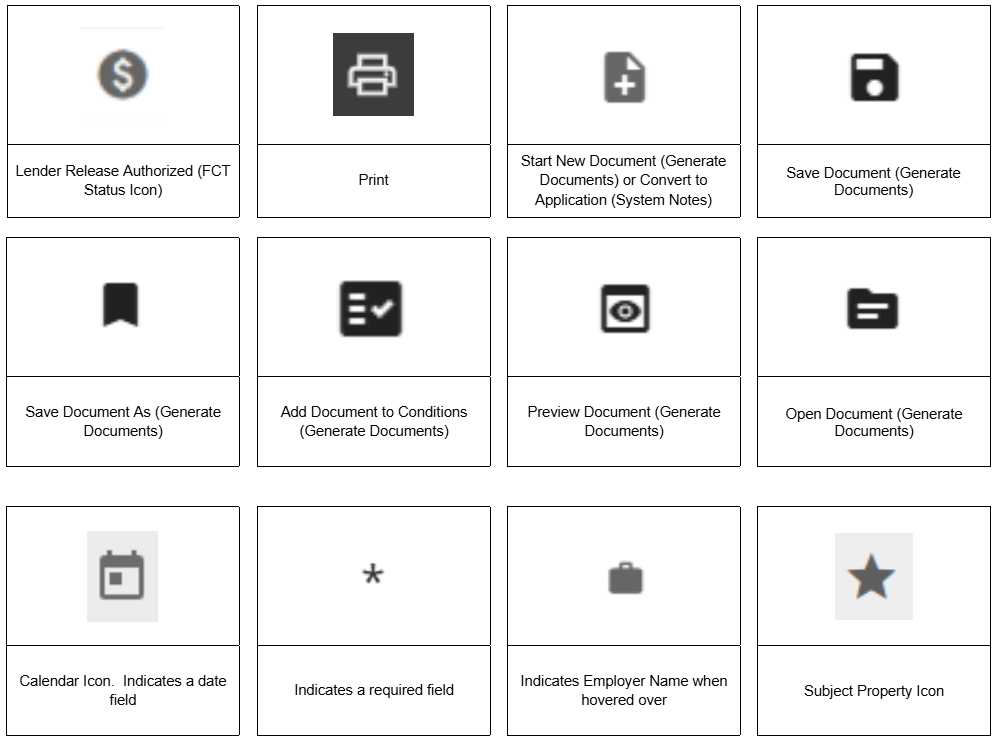
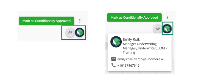
- Multi-User Presence Icon: This icon appears when multiple users are accessing the same application simultaneously. Located below the "Mark As Conditionally Approved" button in the application dashboard, it displays the user's profile picture (or initials if no picture is set). Clicking on it reveals the user's name, role, email, and phone number. Additional users will have their own icons, which disappear once they leave the application.
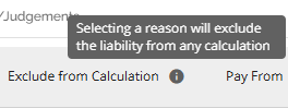
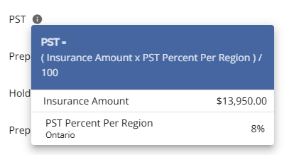
- Tool Tips: Represented by a small "i" (information) icon, tool tips provide additional context or information when clicked on or hovered over. They may include descriptions, explanations, or calculation breakdowns.

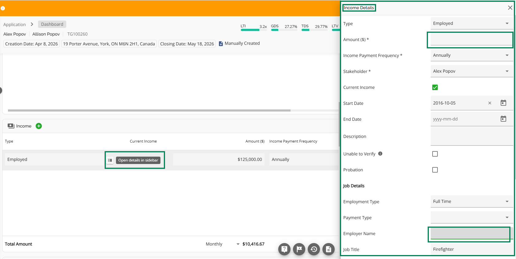
- Open Details in Sidebar: Where available, hovering between specific fields reveals the "Open Details in Sidebar" icon. Clicking it opens a sidebar with additional details and editing options. Once closed, edits are saved automatically.
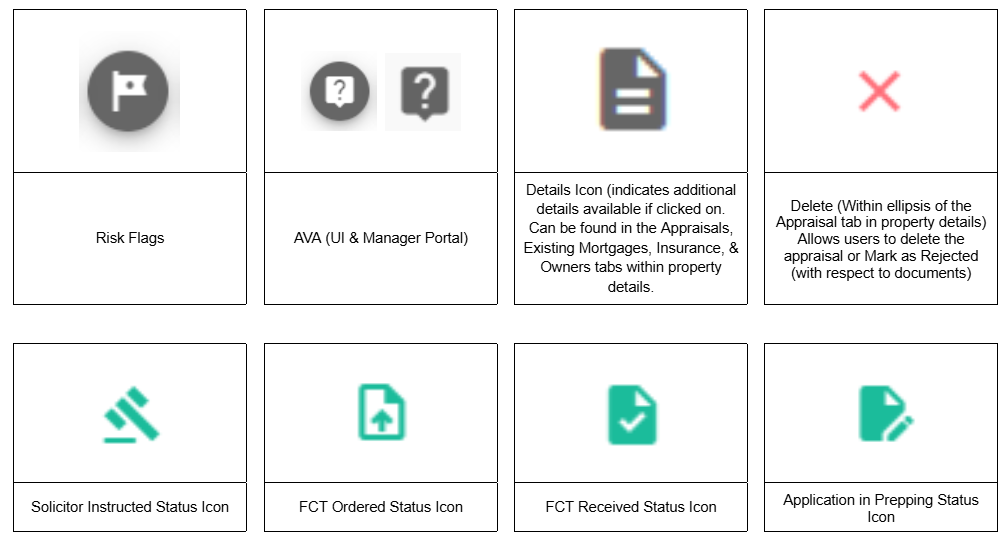
- View Details: Clicking this option expands a more detailed section of a field or opens up the Property Details pop-up. It navigates the user to another section related to the field or to the aforementioned pop-up window .

- Navigate: This terminology is used often in our Product Feature Guides. It describes the action of moving between different sections, pages, or features within the platform.
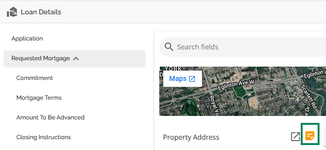
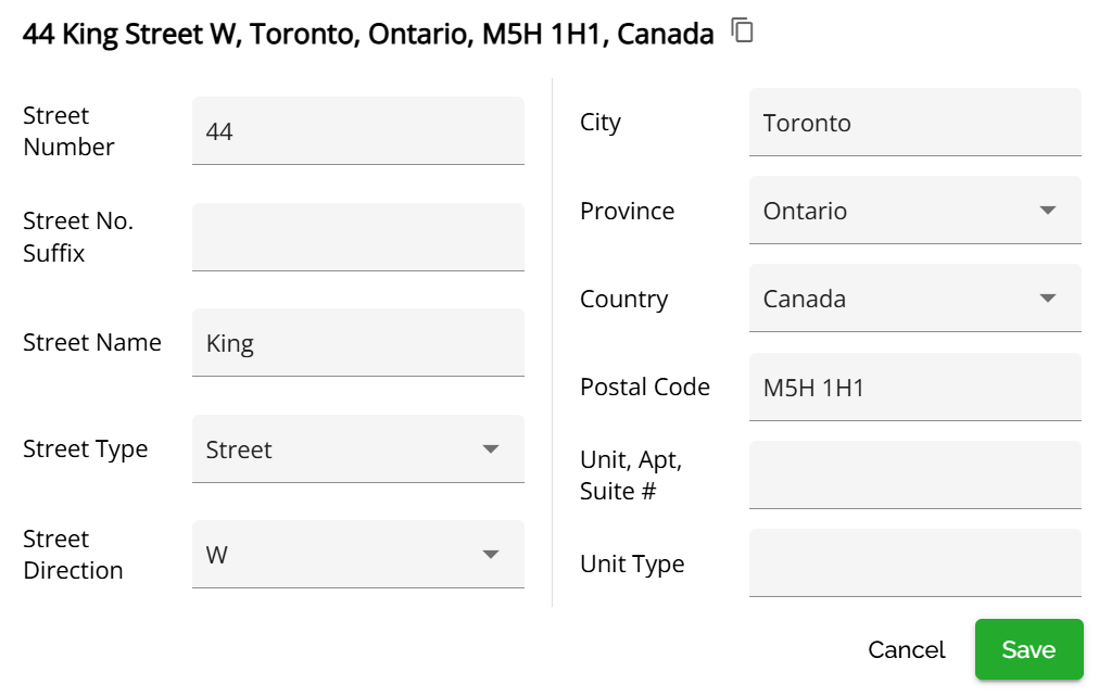
- Address Details Icon: Clicking this icon opens a section with the address segmented into its different components allowing for easier updating.

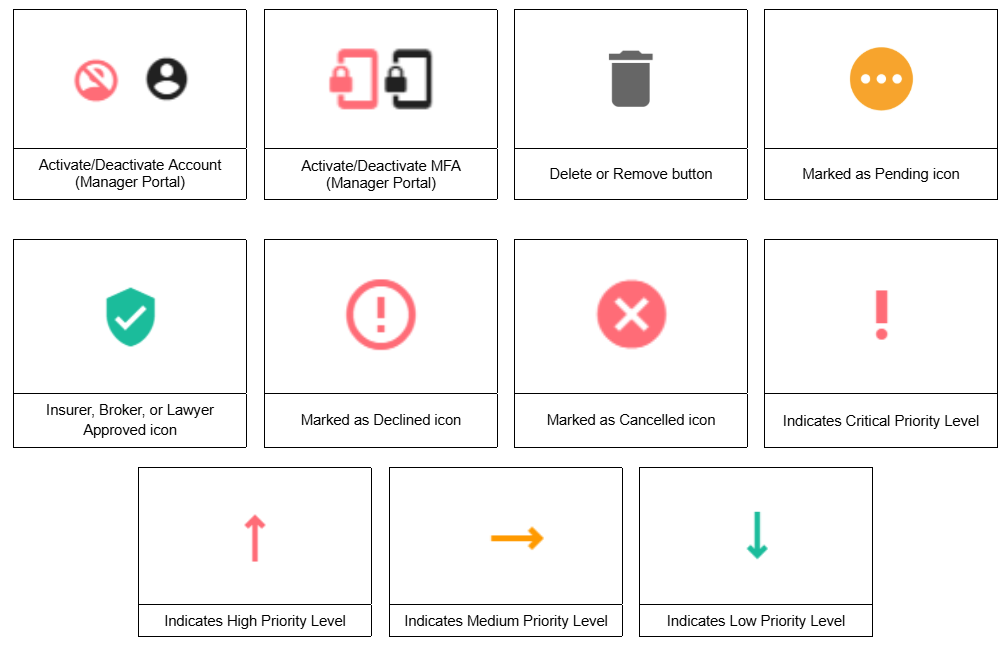
- Delete Icon: Used to remove an item or entry from a list or section. Typically found when selecting an ellipsis to the right of a line item.

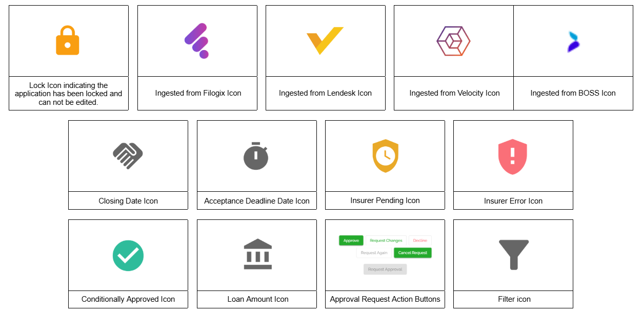
- Filter Icon: Allows users to apply filters to refine data being displayed.

- Green Plus Button: This is a common element within the UI. This button is used to add a new item to the relevant entity.

- Pencil Icon: Indicates that a widget or field is editable. Clicking it enables editing mode.

- Close Edit Mode: Exits editing mode and saves or discards changes based on the user’s actions.
- Maximize Widget Icon: Increases the size of a widget to provide more visibility or interaction space. Commonly found at the top of the Credit Widget and the Income Widget, when in Minimized View.

- Minimize Widget: Reduces the size of a widget while keeping it accessible. Commonly found at the top of the Credit Widget and the Income Widget, when in Maximized View.

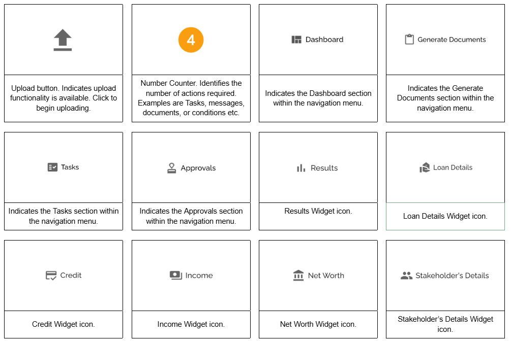
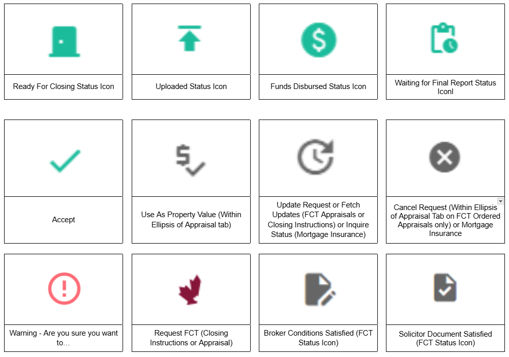
- Upload Icon: Typically represented by an upward-facing arrow. Clicking on it allows users to upload documents.

- Download Icon: Usually depicted as a downward-facing arrow. Clicking it enables users to download files, reports, or other resources.

- Warning Icon: A triangle with an exclamation mark. It signals alerts or important notices.

Icons