![Fundmore-Logo.png]](https://help.fundmore.ai/hs-fs/hubfs/Fundmore-Logo.png?height=50&name=Fundmore-Logo.png)
Table of Contents
Introduction
The Top Menu is located at the very top of the platform and is constant regardless of where you are in the system. Depending on your User permissions, some of the above sections may not be visible. (i.e. Manager Portal).
Company Logo & Headers
The user can move to different sections of the platform by clicking on the menu headers directly to the right of the logo which may consist of: Origination Pipeline, Servicing Pipeline, Reports, Manager Portal, and Settings. The section you are in is visually indicated by a colored line beneath the name of the header. What headers you see here will be dependent on your company configuration and the permissions assigned to your role(s).
Company Logo - The company logo will appear when it has been uploaded in the Manager Portal under the Settings section. If no logo is uploaded, it will default to the FundMore logo. For more information on the logo see our product feature guide Company Settings.
Origination Pipeline - The Origination Pipeline allows users to easily view all applications assigned to them, unless they have wider access permissions to view/edit deals beyond their assigned deals. This section provides a quick and concise overview of the applications, allowing users to track the current stage of each application and view their qualifying information such as applicant type (company or individual), applicant name(s), other stakeholders, status, subject property address, loan amount, loan number, deadline to accept date, closing date, broker, and application source (Ingested from Filogix, Ingested from Velocity, Ingested from Lendesk, or Manually Created). For more information on the Origination Pipeline, see our product feature guide: Origination Pipeline PFG.
Servicing Pipeline - The Servicing Pipeline will only be visible if a) Your company has Servicing enabled and b) your role has the relevant permissions to access Servicing applications. It functions exactly like the Origination Pipeline but shows servicing applications only (Renewals, Payment Changes, & COB Changes). For more information on the Servicing Pipeline, see our product feature guide: Servicing PFG
Reports - The Reports page comes with standard canned reports created by FundMore.ai and can also include any customized reports the lender has created. The page defaults to the Number of Deals by Stage report. A report section can consist of the Reports Search Box, Canned Reports Header and List, Report Title, Report Charts/Graphs, Data Table, and Filter Section. Our reports are generated by Power BI (Click the Power BI link to learn more).

Our canned reports consist of: Number of Deals by Stage, Deal Amount by Stage and Date, Deal Amount by Date, Deals By Stage, Closed Deals by Broker, Deals by Brokerage, Deals by Underwriter, Decline Reasons, Deals by Brokerage, Margin Report, Margin Pipeline and Sankey Diagram.
Note: Reports are customized for each implementation and as a result, your environment may differ from what is described here.
Depending on your role and associated permissions, you may or may not have the ability to access Reports.
Manager Portal - The Manager Portal houses all sections in which the lender can tailor the platform to their individual needs. This is where much of the configuration takes place, directly influencing the system’s functionality. Key areas of customization encompass Conditions, Products, Broker and Lawyer Management, amongst others. The Manager Portal can only be accessed by users with the appropriate permissions. For further information, refer to the respective Product Feature Guides for each section.
Settings - The User Profile and Settings is specific to the user signing into the platform. In this section you can find the User Profile, User Settings, Team Settings and the MFA Settings.
The User Profile section contains all details pertinent to account access, including profile picture management.
The User Settings houses the user’s visual preferences, notification settings, and shows how the user preferences were configured in the Manager Portal.
The MFA Settings houses the user’s Multi-Factor Authentication (MFA) and SMS security settings.
The Team Settings is applicable only for users that are indicated as Direct Manager of other uses. Here they can see who their direct reports are, what roles have been assigned to them and they are able to manage the Preferences set up for each user as well as their OOO if necessary.
Icons

On the top far right corner of the menu, you will find the following icons: Search, Help, Notifications, Notes, Language, and Profile Icon.
Search (Global)
This search function displays results for origination, archived, and servicing deals. Each result clearly identifies which pipeline it belongs to, allowing users to search across all pipelines, provided they have the necessary permissions and servicing is configured in your environment. You can search by applicant name(s), phone number(s) and the broker’s name. The display changes, as you type, to show just the results that match your search criteria. Simply remove the entered text to re-display data for all active borrowers.

As a best practice, Fundmore.ai recommends that you do a search for a new deal from the Origination Pipeline page rather than from within another application. This will yield best results.
Help
Clicking on the ‘Help’ icon will take you to the FundMore.ai Help Page.

Our help page provides a deeper understanding of the platform with a large knowledge base and various product feature guides on how to use the system. Our documentation is organized into four categories. When you click on each category, you will find a list of documents specific to that category. If you are not sure where to look, you can also search using keywords. As you type, the system will provide a list of relevant guides for you to reference.
Integrations - This houses the documentation for any individual integrations we have. Such as integrations with FCT.
Manager Portal - This contains documentation for all sections within the Manager Portal. It would be relevant for users that have access to that section of the system, and are responsible for the configuration of your system.
User Interface - This section provides documentation for all areas of the system that are not part of the Manager Portal. It is relevant for users who interact with the system on a daily basis, such as Underwriters. Here, users can find information and resources to support their day-to-day tasks and operations within the platform.
Troubleshooting Guide - This is a valuable resource for users experiencing system issues. It serves as a self-help guide that we strongly encourage users to consult before reaching out to support. By referring to this guide, users can explore possible solutions and resolve their issues quickly and independently.
Notifications
We have moved this section to its own Product Feature Guide. Navigate to the Notification PFG for information relating to notifications.
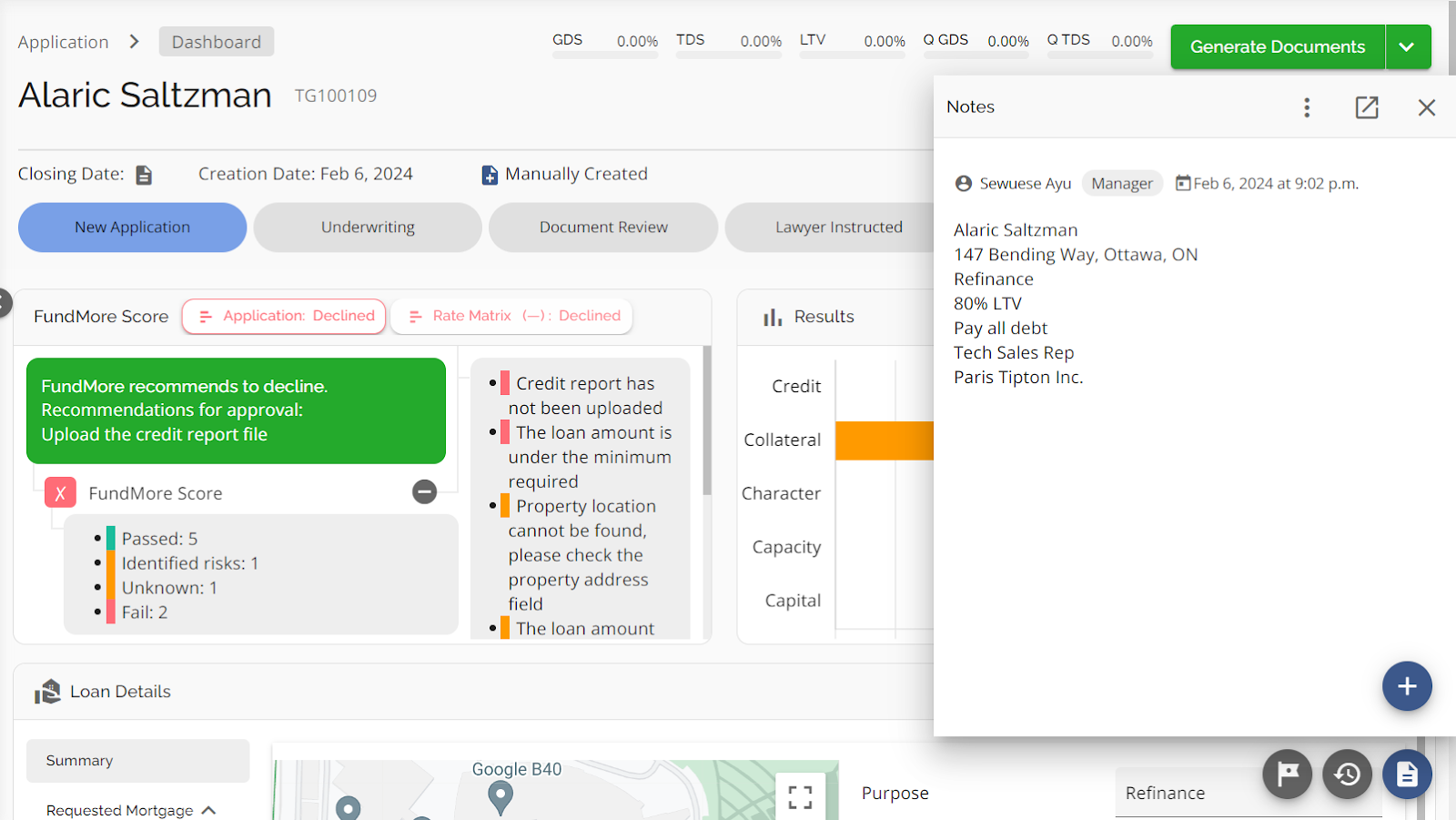
System Notes
This Notes section provides a space within the platform for users to jot down important information unrelated to any specific application. These notes are accessible to all users, fostering collaboration and easy information sharing. Furthermore, notes can seamlessly be transitioned into applications, with the ability to map data items from a note to specific fields within an application.
System Notes are not to be confused with ‘Application Notes’ which are specific to an application and can be found by clicking on the notes icon in the bottom right hand corner from within any application.
Sample Use Case for Notes: An underwriter is in the middle of evaluating an application when they receive a call from a broker discussing a potential deal. With notes, they can keep their existing file open, access the Notes section, and jot down details about the broker’s deal. When the deal materializes, the underwriter can return to the note, extract relevant information, and import it into an application.

To use this feature, click the “Notes” icon located in the top menu bar. A drop-down menu will appear consisting of: a search notes box, a list of existing notes, an add new note button, and a toggle button to show only non-attached notes.
Search Notes - In the top left corner of the drop-down menu, you will find the search notes box. Here, you can enter text or keywords that are related to the notes you have previously created. All notes that match your search criteria will be displayed in the list below.
Show only non-attached notes toggle - Use the toggle located in the top right corner to display only the notes not linked to any applications. To view unattached notes, slide the toggle to the right. To return to the default view, slide the toggle to the left.
Sorting Notes - Column headers can be used to sort the list in ascending or descending order. Simply click on the arrow to the right of the header title. When the arrow is facing upwards the list is sorted in ascending order. When it is facing downwards, the list is sorted in descending order. When you sort the list, the arrow in the column of which you sorted will hold in place to indicate what your sort criteria was.
Line Arrow - Located on the far right of each line on the list. When the arrow is clicked, you will enter the note within that line to view, edit, map, and convert to an application.

Inline Ellipsis - This ellipsis has three options: convert to application, attach to application and delete.

Attach to Application - Selecting this allows you to attach the note directly to the application notes section of an existing application.
Delete - To delete a note simply click this option and the note will be deleted.
Convert to Application - When you select the "Convert to application" option, it directs you to the Create a Manual Application template. The "Convert to application" button is linked to the same permission as “Create Manual Application”.


Upon clicking "Convert to Application," you will be directed to the Manual Application page where your notes seamlessly transition into the Application Notes box. This action automatically copies your notes into the Manual Application notes, mapping any specified fields. This ensures that upon conversion, the application is created with all relevant information accurately mapped (with data into designated fields and notes into the application notes).
Note: This feature is disabled if your organization does not support Manual Application Creation.
While in the Manual Application view, you have the option to click on the “Show Note” button, enabling you to review your notes alongside the content in the Application Notes box.
You can scroll through the application form to verify that your mapped fields have indeed been mapped and fill in any additional required information.


After submission, your application is created and visible in the Pipeline View, with the application source denoted as Manual Application.

When accessing the dashboard of the application, you will find that the application notes have been copied over to the Notes section of the dashboard, and the fields you mapped are accurately populated as intended.

From this point onwards, you can proceed with your application process as required.
Add a New Note Button - Used to create a new note.
The new note page consists of: Note Name, Text Box, Mapped Value Search Box, Add a New Mapped Value Button, and Convert to Application Button.
Note: When you enter a note to edit/view the same items appear.

Name - A title/short description of the note.
Text Box - Input field to enter information, as needed. The text entered in this field can also be used for mapping. To map data to a field in an application, highlight the text you wish to map. In the pop-up that appears, select the field or category you want to map the value to.

Mapped Value Search Box - In the top right corner, you will find a search box where you can enter text or keywords that are related to the previously created mapped values. As you type, all mapped values containing the search text/keywords will be displayed in a list below.
‘Add a New Mapped Value’ button - When this button is clicked, a drop down will appear. Enter the data for the value you want to map and the field you want to map it to. Then, click the ‘Add mapped value’ button.
Note: Both 'Value' and 'Field' are required fields.

Mapped Value List and Headers - You can sort the list by clicking the arrows next to the headers. When the arrow is pointing up the list is sorted in ascending order, and when the arrow is pointing down the list is sorted in descending order. To delete a mapped value, click the inline ellipsis and select the ‘Delete’ option. The Mapped value will be deleted.
Edit a Note - To edit a note, click on the arrow ( ) inline with the note you want to modify. A window will open, allowing you to select the fields that need updating and enter the new information. Any changes made will be saved automatically.
View a Note - Click the arrow ( ) inline with the note you wish to view
You can scroll through the application form to verify that your mapped fields have indeed been mapped and fill in any additional required information.

After submission, your application is created and visible in the Pipeline View, with the application source denoted as Manual Application.
When accessing the dashboard of the application, you will find that the application notes have been copied over to the Notes section of the dashboard, and the fields you mapped are accurately populated as intended.
From this point onwards, you can proceed with your application process as required.
Add a New Note Button - Used to create a new note.
The new note page consists of: Note Name, Text Box, Mapped Value Search Box, Add a New Mapped Value Button, and Convert to Application Button.
Note: When you enter a note to edit/view the same items appear.

Name - A title/short description of the note.
Text Box - Input field to enter information, as needed. The text entered in this field can also be used for mapping. To map data to a field in an application, highlight the text you wish to map. In the pop-up that appears, select the field or category you want to map the value to.

Mapped Value Search Box - In the top right corner, you will find a search box where you can enter text or keywords that are related to the previously created mapped values. As you type, all mapped values containing the search text/keywords will be displayed in a list below.
‘Add a New Mapped Value’ button - When this button is clicked, a drop down will appear. Enter the data for the value you want to map and the field you want to map it to. Then, click the ‘Add mapped value’ button.
Note: Both 'Value' and 'Field' are required fields.

Mapped Value List and Headers - You can sort the list by clicking the arrows next to the headers. When the arrow is pointing up the list is sorted in ascending order, and when the arrow is pointing down the list is sorted in descending order. To delete a mapped value, click the inline ellipsis and select the ‘Delete’ option. The Mapped value will be deleted.
Edit a Note - To edit a note, click on the arrow ( ) inline with the note you want to modify. A window will open, allowing you to select the fields that need updating and enter the new information. Any changes made will be saved automatically.
View a Note - Click the arrow ( ) inline with the note you wish to view.
Language Icon

Users have the option to switch between English and French languages according to their preference. By default, the system is set to English. To work in French, simply click on the language icon and select "Français".
The system will save a user’s preferred language selection if one is made. I.E. If a user selects French at the application level, logs out, and logs back in, the UI will load in French instead of defaulting to English.
Note: Text fields within the LOS will not auto translate. These fields will need to be completed in French or English by the user.
Note: Quebec province indicator will default to French. The indicator for the other Canadian provinces will default to English.
User Profile & Settings

When the user selects the Profile Icon/Image, a drop down will appear. From the drop-down menu, users have the option to select "User Profile", which will take them to their User Profile and User Settings, or "Logout", which will log them out of the platform. See User Profile Product Feature Guide for more details on this section.