![Fundmore-Logo.png]](https://help.fundmore.ai/hs-fs/hubfs/Fundmore-Logo.png?height=50&name=Fundmore-Logo.png)
Table Of Contents
‘Generate Documents’ Tabs, Sections, Items and their Functionality
‘Build Commitment Package’ Tab
Preview Documents Arrow & Drop-Down
‘Preview Commitment Package’ Page
Document Tabs Menu & Document Tab Ellipsis
How To Prepare and Send a Document Package
Introduction
Generate Documents is where the user can prepare any necessary documents to be sent to stakeholders Some examples of such documents are Commitment letters, Disclosures, Solicitor Instructions, etc. Documents can be generated and sent to stakeholders at any stage of the application process.
To navigate to the Generate Documents section, select the “Generate Documents” option from the menu on the left-side of the application dashboard. Alternatively, you can click on the green “Generate Documents” button in the top right corner of the application dashboard.
-png.png?width=688&height=130&name=Untitled%20design%20(8)-png.png)
‘Generate Documents’ Tabs, Sections, Items and their Functionality
The “Generate Documents” section is segmented into three different tabs: Commitment, Conditions of Approval, and Build Commitment Package. When you navigate to the Generate Documents page, by default it will take you either directly to the Commitment Tab or the Build Commitment Package Tab depending on whether any conditions have been applied to the application or not. If no conditions have been applied, you will be directed to the Commitment Tab. If conditions have been applied, you will be directed to the Build Commitment Package Tab. The active tab is always underlined acting as a visual cue to confirm which tab you are working in.
-png.png?width=688&height=474&name=Untitled%20design%20(9)-png.png)
‘Commitment’ Tab
The commitment tab is a summary of the terms, fees, document due dates, and other debts listed on the application. All of this information will populate within the generated documents. It allows the user to quickly review the information before generating documents to ensure accuracy and make any changes as needed without having to navigate back to the dashboard of the application. It is loosely segmented into three different sections: Loan Details, Fees, and Other Debts. Each section is described below:

‘Loan Details’ Section

The Loan Details section houses information regarding the terms of the mortgage that will populate any documents generated. The section includes fields such as mortgage amount, monthly payment, rate, term, amortization etc.
You can view the data entered within its associated box if entered in the dashboard. Fields in the Loan Details section can be edited by clicking on the field you wish to update and enter the data or clicking the option you desire to update the field to. The system will automatically save any updates made. Any field that cannot be updated will be grayed out. Some examples include Accelerated Weekly Payment, Amount to be Advanced, Interest Adjustment Amount, etc. Such fields will update automatically based on any changes made to fees and dates.
Within this section, the dates associated with the loan can also be found. These include the following:
Closing Date is the date on which the mortgage transaction is closed. It can not be set in the past.
Condition of Financing Date is the date indicated on the purchase and sale agreement that the contract becomes firm and any conditions in the contract need to be accepted or rejected. This is a manual input field unless it has been input into Velocity and mapped through to FundMore.
Funding Date comes from the POS and is typically the same as the closing date, although it can be modified. It is important to note that this date has no correlation to any other date in the system.
Deadline Date is intended to indicate the date the client is required to sign back by. The system will default to the creation date + 10 days but we may be able to configure this as needed. If you have our DM solution it links to the Deadline Due Date on your document request. This field has a backend calculation to calculate the date based on the application creation date. It does not have a direct impact on any other fields.
First Required Payment Date is the date the first regular payment will be due. It is a factor of the closing/funding date, payment frequency, and the IAD.
Maturity Date is the date the mortgage will mature on. It is calculated based on a function of the IAD and term.
Interest Adjustment Date can be either an automatic setting if you have preferred payment dates such as the 1st of the month or it can be manually edited.
Documents Due Date is the date the client is required to be broker complete and have met all conditions.
Some of these dates will auto populate based on what was entered in the POS system and some require manual input. Changes can be made if needed and the other fields will update automatically. For example, the borrower decides to change their payment frequency. The user would update the payment frequency in the requested mortgage tab, and the Interest Adjustment Date, First Regular Payment Date, and Maturity Date would update as necessary.
Note: Any details updated in this section will automatically apply to the associated fields in the Loan Details widget. For example, if the Term Length field is changed here, it will update in the Term Length field in the Loan Details widget.
‘Fees’ Section

The Fees section will summarize all application fees as indicated in the Loan Details widget. You can view the data entered within its associated box if entered in the dashboard. Fields in the Fees section can be edited by clicking on the field you wish to update and enter the data or clicking the option you desire to update the field to. The system will automatically save any updates made. For more information on the fees and fees list, refer to the ‘Fees’ Tab section of the ‘Loan Details’ Widget PFG.
Note: Any details updated in this section will automatically apply to the associated fields in the Loan Details widget.
‘Other Debts’ Section

The Other Debts section houses any non mortgage liabilities associated with the application, and how they are being handled. The information relates to what was entered in the Credit widget in the dashboard. It indicates if these liabilities are being paid off from proceeds or not, or possibly being paid prior to advance. You are able to make any necessary edits here as you would in the credit widget. For more information on liabilities/debts and the associated lists, refer to the ‘Credit’ Widget PFG.
Note: Any details updated in this section will automatically apply to the associated fields in the Credit widget.
‘Conditions of Approval’ Tab
This tab mirrors the Conditions widget in the dashboard. For more information on the functionality, refer to the ‘Conditions and Documents’ Widget PFG.
‘Build Commitment Package’ Tab

Document List & Headers
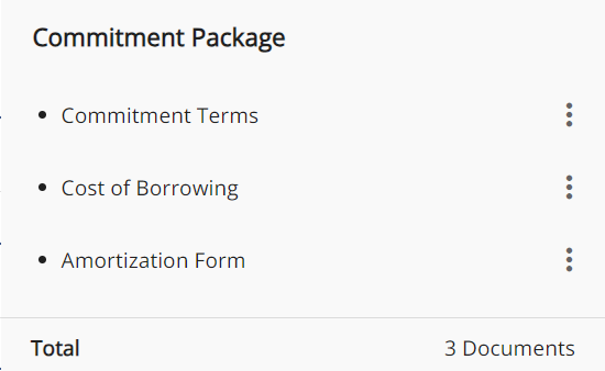
The documents are listed under header categories (Amortization Form, Borrowing Documents, Commitment Terms, Disclosure Documents, Lawyer Instructions, Letter and Mortgage Presentation). When you are ready to generate the necessary documents for your application, click on the Build Commitment Package tab. You will see a list of all available documents that can be included in the package sent to the applicable stakeholders for signature.
Depending on how the documents were created and the advanced settings associated with them in the Manager Portal, you will see icons to the left of their name:
|
|
Indicates the document is part of the Commitment Letter Package and will be generated with the package. Documents with this icon when selected will form 1 document so that the commitment can be sent back through the POS system. POS systems have a limitation of only allowing one document to be sent back. This functionality allows the lender to group documents into one to get around this limitation. |
 |
Indicates the document is property dependent and will generate for each property selected. |
 |
Indicates that the document is per applicant. To generate this document, you must choose the applicants it pertains to. |
 |
Indicates that the document is per lawyer. To generate this document, you must choose the lawyer it pertains to. |
 |
Indicates this is a standalone document. This means it is not part of a commitment package or tied to individual applicants or lawyers. |
Each document can be added to, or removed from, the commitment package.

To add a document to a commitment package, click anywhere on the item line or the + button to the far right. You will see that the plus 

To remove a document from a commitment package, click on the list line ellipsis and then click “Remove”. Alternatively, or click on the minus
Search Box - This is located on the top left of the section just below the top tab menu. In the search box, you are able to enter text/keywords related to document names. All related documents with the search criteria in their names will appear in a list below.
Preview Documents Arrow & Drop-Down
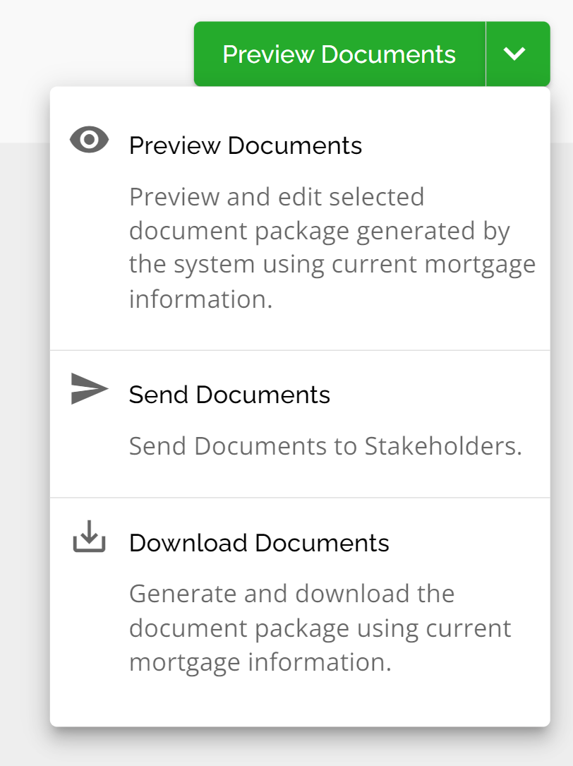
‘Preview Documents’ Button
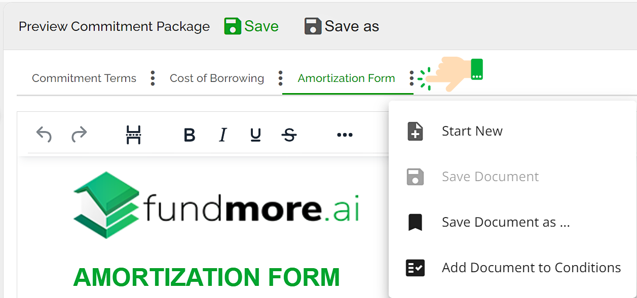
Once you have selected all the documents you wish to add to your package, you can then review & edit them. To do so, select the Preview Documents button (A drop down menu will appear with several options. Preview documents is the first option). Select Preview Documents. All the documents you have selected to form your package will populate the Preview Commitment Package screen. Each document you selected as a part of your commitment package will appear under its own tab
‘Preview Commitment Package’ Page
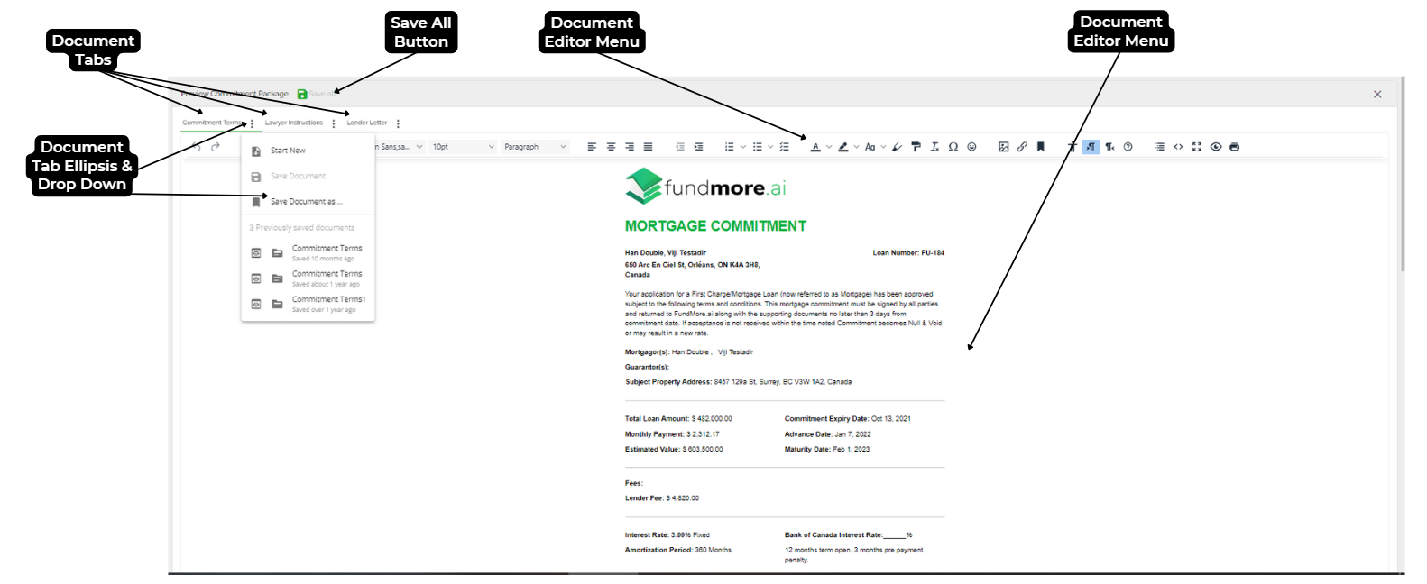
The Preview Commitment Package Page is a document editor where a user can make edits to the documents within your commitment package before sending them to the stakeholder(s). It consists of the Document Tabs Menu and Document Tabs Ellipsis, Save All Button, Document Editor Menu and the Document Editor.
Document Tabs Menu & Document Tab Ellipsis
Each document chosen for the Commitment Package will have a tab in the Documents tab menu above the Document Editor Menu. You can go to a document by selecting the associated tab. When the ellipsis 
Start New - Resets the document to the original state prior to any edits being made.
Save Document - Allows you to save the document. If you are working on a previously saved document, make edits, and click Save Document, it will save the current version overriding the previously saved version.
Save Document As - Allows you to save a new version of the document under the name you have given it in the bottom of the drop down menu. This allows you to save multiple versions of the same document if necessary.
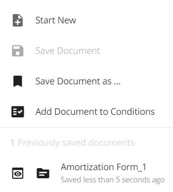
Previous Versions - Any time the “Save Document” or “Save Document As” options are successfully used, a new version of the document will be saved and available to open.
Document Editor Menu

The user is able to edit the text and content with use of the Document Editor. Within the document editor menu, there are options to customize the font (by style, size, color, type {paragraph or title format}, highlight, Upper or Lower case, Bold, Italic, Underline, Strike through, permanent pen, and format painter), format the content (Index alignments, Indent increase or decrease, Anchor, Insert/Edit link, and left or right index changer), Add/edit an image, link, print breaks, special characters, emojis, lists and table of contents. You can also check the accessibility, view the Document Editor Menu help content, view the source code, have a document in full screen, preview a document, clear formatting, and print.

|
Button/Function |
Functionality |
|
Undo Button |
Select this button to undo the last action taken in content of the editor body. |
|
Redo Button |
Select this button to redo the last action taken in content of the editor body after undo selected or item erased. |
|
Page Break Button |
Enter page breaks in the body of the editor. Select this button after placing the cursor in the body of content where you would like a page break added. |
|
Bold text function |
Highlight text and/or click this function before typing to bold any text in the body of the editor. |
|
Italic text function |
Highlight text and/or click this function before typing to italicize any text in the body of the editor. |
|
Underlining function |
Highlight text and/or click this function before typing to underline any text in the body of the editor. |
|
Strikethrough function |
Highlight text and/or click this function before typing to strike through any text in the body of the editor. |
|
Horizontal Ellipsis |
Click this ellipsis to view the menu bars for additional functionalities for the body of the editor. |

|
Button/Function |
Functionality |
|
Spellcheck |
This tool, when utilized, will check the body of the editor for any possibly incorrect words. It will underline the words in red and offer suggestions (To see suggestions right click the word with red underlining). |
|
Spell Check Drop Down List of Languages |
Click the downward facing arrow directly to the right of the spell check button. A drop down list will appear with multiple languages listed. Click your preferred language for the spellcheck to utilize. |
|
Font Style |
Style of font associated with text being used, clicked on or highlighted in the body of the editor. |
|
Font Size Drop Down List of styles |
Click the downward facing arrow directly to the right of the Font Style to choose a font style in a drop down list. |
|
Font Size |
Size of font name associated with text being used, clicked on or highlighted in the body of the editor. |
|
Font Size Drop Down List of styles |
Click the downward facing arrow directly to the right of the Font Style to choose a font style in a drop down list. |
|
Font Type |
Type of font name associated with text being used, clicked on or highlighted in the body of the editor. |
|
Font Size Drop Down List of types |
Click the downward facing arrow directly to the right of the Font Type (i.e. Paragraph, Heading 1, Heading 2, Heading 3, Preformatted… etc.) to choose a font style in a drop down list. |
|
Left Index |
Places editor body content being used, clicked on or highlighted in the editor on the left index. |
|
Middle Index |
Places editor body content being used, clicked on or highlighted in the editor in the middle. |
|
Right Index |
Places editor body content being used, clicked on or highlighted in the editor on the right index. |
|
Full Body Index |
Places editor body content being used, clicked on or highlighted in the editor to the full body. |

|
Button/Function |
Functionality |
|
Decrease Indent |
Select this button to decrease the indent of your editor body content. |
|
Increase Indent |
Select this button to increase the indent of your editor body content. |
|
Numbered List |
Click this function to create a list in your editor body with numbered lines. |
|
Numbered List Drop Down List |
Click the downward facing arrow directly to the right of the Numbered List to choose a numbered list style in a drop down list. |
|
Bullet List |
Click this function to create a list in your editor body with bullet points. |
|
Bullet List Drop Down List |
Click the downward facing arrow directly to the right of the Numbered List to choose a numbered list style in a drop down list. |
|
Text Color |
Highlight text and/or click this function to change the color of the text. |
|
Text Color Drop Down List |
Click the downward facing arrow directly to the right of the Numbered List to choose a text color in a drop down list. |
|
Background Color |
Highlight text and/or click this function to change the background color of the text. |
|
Background Color Drop Down List |
Click the downward facing arrow directly to the right of the Numbered List to choose a background color in a drop down list. |
|
Capitalization |
Highlight text and/or click this function to capitalize the text. |
|
Capitalization Drop Down List |
Click the downward facing arrow directly to the right of the Numbered List to choose lowercase, uppercase or title case in a drop down list. |
|
Permanent Pen |
Select the permanent pen to type in a preset formatting. The default formatting is a bold red Arial font in size 12. To change the default formatting, right click on text that has been written using the permanent pen and select Permanent Pen Properties. |
|
Format Painter |
Click and hover over areas to recreate the same formatting from one area to another. |

|
Button/Function |
Functionality |
|
Insert Image Button |
In the body, place your cursor where you would like to insert an image - select insert image button and select image. |
|
Insert/Edit Link Button |
Highlight text and/or click this function to insert or edit hyperlink associated with the text. |
|
Anchor button |
Click the anchor button to anchor and lock any content in the body where it is. |
|
Accessibility Checker |
Highlight text and/or click this function to review if the content is accessible to readers with vision impairments and what suggested edits could be made to make content more legible. |
|
Left to Right Function |
Highlight text and/or click this function to type left to right. |
|
Right to Left Function |
Highlight text and/or click this function to type right to left. |
|
Table of Contents button |
Place the text cursor where you would like to create a table of contents and click this button |
|
Source Code button |
Click this button to show the source code of the content within the Template Editor |
|
Full Screen button |
Click this button to view the Template Editor in the body of the page and hide all other sections. |
|
Preview Pop Up button |
Click this button to view the Preview in a pop up. |
|
Print button |
Click this button to print content in the Template Editor. |
Document Editor

The document editor is where the user makes changes to the content of the document. If a user highlights a section of the document, a pop up menu will appear. The pop menu consists of the following options: Bold, Italic, Underline, Add/Edit link, Font format type (Titles or paragraph), Tab, Add/Edit image and Add/Edit tables.
Attach Documents - Attach document package to the current application.
Send Documents to FundMore DM - Upload documents into the FundMore DM document request. This only applies for clients that also have the Document Management functionality. If this does not apply, it will be grayed out and you will not be able to action.
Send Documents - Send documents to the stakeholder(s).
Download Documents - Generate and download the document package in PDF format allowing the user to either save to a file folder or email out as an attachment.
While you are in the Preview Documents Mode, the green button in the top right hand corner will change from Preview Documents to Download Documents and you will only be able to either Send or Download your documents if necessary.

How To Prepare and Send a Document Package
Step 1 - Navigate to Generate Document and select the Build Commitment Package. You can complete this step via the navigation menu or in the ‘Conditions and Documents’ Widget when completing the Conditional Approval workflow.
Step 2 - Select the documents you wish to form the package you are preparing by selecting the plus (+) button to the right of the document name, i.e. documents to form a commitment package or an instruction package.
Step 3 - Once you have added all the relevant documents to your package list, click on the Preview button.
Step 4 - Review your document(s) to ensure accuracy and nothing is missing. Make any necessary edits as needed.
Step 5 - Once you are satisfied with the content of the document, you need to save your document. You can do so by clicking on the ellipsis button to the right of the document tabs and selecting your choice from the drop down menu, clicking on the green “Save” icon or Grey “Save as” icons to the right of Preview Commitment Package. Your document will save and be available for viewing, sending, or downloading as you need it.
Note: You can save multiple versions of your document(s) and all will be saved individually for subsequent access if needed. You can preview or open each document as needed by simply clicking on either of the two icons to the left of the saved document you wish to work with. If you have saved different versions of a document, they will be listed when you click on the ellipsis.
Step 6 - Send you document(s). You can do so by selecting the package as part of your conditional approval workflow, sending directly to stakeholders on the application, or downloading and emailing from there.
If generating and sending as part of the conditional approval workflow the steps are as follows:
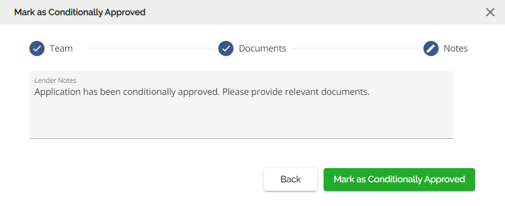
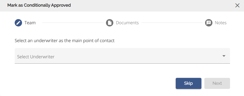
Step 1 - Select Mark as Conditionally Approved for the action ellipsis in the dashboard left hand menu.

Step 2 - Select the underwriter from the drop down and click Next.
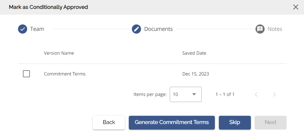
Step 3 - Select the documents you wish to send with the Conditional Approval and click Next.
Step 4 - Enter any lender notes and click “Mark as Conditionally Approved” The conditional approval along with the commitment package will be sent back through the POS.